Tufte CSS: An Adaptation
An adaptation by Chris J. Zähller
Introduction
Tufte CSS provides tools to style web articles using the ideas demonstrated by Edward Tufte’s books and handouts. Tufte’s style is known for its simplicity, extensive use of sidenotes, tight integration of graphics with text, and carefully chosen typography.
The original Tufte CSS, of which this is an adaptation, was created by Dave Liepmann and is now an Edward Tufte project. The original idea was cribbed from Tufte-LaTeX and R Markdown’s Tufte Handout format. We give hearty thanks to all the people who have contributed to those projects.
This is only one possible way to lay out a web page. While we have endeavored to remain true to Tufte’s spirit, we caution against slavish imitation. This adaptation deviates from the original Tufte CSS in several ways, and we encourage you to alter it further to suit your own needs.
Getting Started
Because this is a custom implementation, we don’t have an easy way to provide you, dear reader, with very useful source files. But if you’d like to have a look at the style sheet, you can find the uncompressed version at https://mercury-photo/wp-content/themes/mercurymakespix/admin/css/style.merged.css. You can see the links to the custom fonts in the document <head>. And finally, since many of the font-family rules are inlined to optimize performance, you can see those rules in the document <head> as well.
Fundamentals
Sections, Headings, and Lists
Organize your document with an article element inside your body tag. Inside that, use section tags around each logical grouping of text and headings.
Tufte CSS uses h1 for the document title, p with class subtitle for the document subtitle, h2 for section headings, and h3 for low-level headings. More specific headings are not supported in the original Tufte CSS. We provide support for them in this adaptation; however, if you feel the urge to reach for a heading of level 4 or greater, consider redesigning your document:
[It is] notable that the Feynman lectures (3 volumes) write about all of physics in 1800 pages, using only 2 levels of hierarchical headings: chapters and A-level heads in the text. It also uses the methodology of sentences which then cumulate sequentially into paragraphs, rather than the grunts of bullet points. Undergraduate Caltech physics is very complicated material, but it didn’t require an elaborate hierarchy to organize.
As a bonus, this excerpt regarding the use of headings provides an example of block quotes. In Tufte CSS they are just lightly styled, semantically correct HTML using blockquote and footer elements. See page 20 of The Visual Display of Quantitative Information for an example in print.
Here is what the headings look like:
Heading 1
Heading 2
Heading 3
Heading 4
Heading 5
Heading 6
If you must use them, here are what lists look like. The ordered list supports a single level with no nesting.
- Foo
- Bar
- Foobar this is a very long item that wraps so I’ll just keep typing yep still not long enough okay maybe we’re getting there
- Barfoo
- Fundus
- Wundus
- Mundus
- Helpus
- Mundus
- Wundus
- Fundus
- Some Greenfish
- The Lights from my Lady Cranfeildes Chamber
- Two dozen of Pewter spoons
- One greate fireshovell for ye nursery
- Ye others which were sent to be exchanged for some of a better fashion
- A new frying pan
- A stoute length of rope
- Some freshe egges
- Sufficient twine to tie up a goose for my Lady Cranfeildes guestes
- Together with a note of ye prises of such Commoditie for ye rest
In his later books, [Sidenote: Beautiful Evidence] Tufte starts each section with a bit of vertical space, a non-indented paragraph, and the first few words of the sentence set in small caps. [Sidenote: This demo also styles other elements, such as abbreviations, with small caps, e.g., USA, AFL-CIO, and NASA.] For this we use a span with the class newthought, as demonstrated at the beginning of this paragraph. Vertical spacing is accomplished separately through <section> tags. Be consistent: though we do so in this paragraph for the purpose of demonstration, do not alternate use of header elements and the newthought technique. Pick one approach and stick to it.
Text
Although paper handouts obviously have a pure white background, the web is better served by the use of slightly off-white and off-black colors. This adaptation of Tufte CSS uses rgb(255, 251, 245) and rgb(38, 38, 38) because they are nearly indistinguishable from their ‘pure’ cousins, but dial down the harsh contrast. Which color is used for text and which for background depends on whether you are viewing this page in light mode or dark mode. Toggle the color switcher at the top of this page to see the alternate color scheme.
Apart from the dropcaps, we stick to the greyscale for text, reserving color for specific, careful use in figures and images. Color in code blocks is handled via the Google Code Prettify library.
In print, Tufte has used the proprietary Monotype Bembo [Sidenote: See Tufte’s comment in the Tufte book fonts thread.] font. A similar effect is achieved in digital formats with the now open-source ETBook, which Tufte CSS supplies with a @font-face reference to a .ttf file. In this adaptation, we employ the excellent Merriweather typeface from Sorkin Type, with headings set in Playfair Display.
Also notice how Tufte CSS includes separate font files for bold (strong) and italic (emphasis), instead of relying on the browser to mechanically transform the text. This is typographic best practice.
If you prefer sans-serifs, use the sans class. In this adaptation, we’ve opted for Merriweather Sans instead of Tufte’s preferred sans-serif, Gill Sans. [Sidenote: While Gill Sans is a favorite of Tufte, it is a problematic typeface. We cannot recommend it unless you are designing covers for Penguin Books.]
Links in Tufte CSS match the body text in color and change color on hover, focus, and activation. Here is a dummy example that goes nowhere. These links are underlined, since this is the most widely recognized indicator of clickable text. [Sidenote: Blue text, while also a widely recognizable clickable-text indicator, is crass and distracting, not to mention inaccessible to users with some forms of color-blindness. Luckily, it is also rendered unnecessary by the use of underlining.] Because browsers now implement text-decoration-skip: skip (Safari) or text-decoration-skip-ink: auto (all other modern browsers), we have dispensed with Adam Schwartz’s faux-underline technique as used in the original Tufte CSS.
As always, these design choices are merely one approach that Tufte CSS provides by default. Other approaches could also be made to work. The goal is to make sentences readable without interference from links, as well as to make links immediately identifiable even by casual web users.
Epigraphs
The English language … becomes ugly and inaccurate because our thoughts are foolish, but the slovenliness of our language makes it easier for us to have foolish thoughts.
For a successful technology, reality must take precedence over public relations, for Nature cannot be fooled.
I do not paint things, I paint only the differences between things.
If you’d like to introduce your page or a section of your page with some quotes, use epigraphs. Modeled after chapter epigraphs in Tufte’s books (particularly Beautiful Evidence), these are blockquote elements with a bit of specialized styling. Quoted text is italicized. The source goes in a footer element inside the blockquote. We have provided three examples in the epigraph of this section, demonstrating shorter and longer quotes, with and without a paragraph tag, and showing how multiple quotes within an epigraph fit together with the use of a wrapper class.
Sidenotes: Footnotes and Marginal Notes
One of the most distinctive features of Tufte’s style is his extensive use of sidenotes. [Sidenote: This is a sidenote.] Sidenotes are like footnotes, except they don’t force the reader to jump their eye to the bottom of the page, but instead display off to the side in the margin. Perhaps you have noticed their use in this document already. You are very astute.
Sidenotes are a great example of the web not being like print. On sufficiently large viewports, Tufte CSS uses the margin for sidenotes, margin notes, and small figures. On smaller viewports, elements that would go in the margin are hidden until the user toggles them into view. The goal is to present related but not necessary information such as asides or citations as close as possible to the text that references them. At the same time, this secondary information should stay out of the way of the eye, not interfering with the progression of ideas in the main text.
Sidenotes consist of two elements: a superscript reference number that goes inline with the text, and a sidenote with content. To add the former, just put a label and dummy checkbox into the text where you want the reference to go, like so:
<label for="sn-demo"
       class="note__toggle note__number" alt="note">
</label>
<input type="checkbox"
       id="sn-demo"
       class="note__toggle" aria-role="note" />
You must manually assign a reference id to each side or margin note, replacing “sn-demo” in the for and the id attribute values with an appropriate descriptor. It is useful to use prefixes like sn- for sidenotes and mn- for margin notes.
Immediately adjacent to that sidenote reference in the main text goes the sidenote content itself, in a small element with class note__side. This tag is also inserted directly in the middle of the body text, but is either pushed into the margin or hidden by default. Make sure to position your sidenotes correctly by keeping the sidenote-number label close to the sidenote itself.
If you want a sidenote without footnote-style numberings, then you want a margin note. [Sidenote: This is a margin note. Notice there isn’t a number preceding the note. ] On large screens, a margin note is just a sidenote that omits the reference number. This lessens the distracting effect taking away from the flow of the main text, but can increase the cognitive load of matching a margin note to its referent text. However, on small screens, a margin note is like a sidenote except its viewability-toggle is a symbol rather than a reference number. The <label> element wraps the symbol. This document uses the FontAwesome sticky note glyph (<span class="fa-layers fa-fw mn-"><i class="far fa-sticky-note aria-role="hidden"></i><i class="fas fa-sticky-note aria-role="hidden"></i></span>), but it’s up to you.
Margin notes are created just like sidenotes, but with the note__margin class for the content and the note__toggle class for the label and dummy checkbox. For instance, here is the code [Sidenote: For WordPress, we’ve created a shortcode. that uses the syntax [mn‐ id="mn-my-unique-id"]My margin note text goes here.[/mn‐] Similarly, use [sn‐ id="sn-my-unique-id"]My side note text goes here.[/sn‐] to generate a sidenote.] for the margin note used in the previous paragraph:
<label for="mn-demo" class="note__toggle" alt="note">
  <span class="fa-layers fa-fw mn-">
    <i class="fas fa-sticky-note" aria-role="hidden"></i>
    <i class="far fa-sticky-note" aria-role="hidden"></i>
  </span>
</label>
<input type="checkbox" id="mn-demo" class="note__toggle" aria-role="note" />
<small class="note note__margin">
  <span class="h-screen-reader-text"> [Sidenote: </span>
  This is a margin note. Notice there isn’t a number preceding the note.
  <span class="h-screen-reader-text">] </span>
</small>
Figures in the margin are created as margin notes, as demonstrated in the next section.
Tables
Tabular data are presented with right-aligned numbers, left-aligned text, and minimal grid lines. Table labels are margin notes placed inside a <p> tag that wraps the <table>.
[Sidenote: Table 1: First Row of MTcars]
| Make + Model | mpg | cyl | disp | hp | drat | wt |
|---|---|---|---|---|---|---|
| A responsive table based on Edward Tufte’s design principles. | ||||||
| Mazda RX4 | 21.0 | 6 | 160 | 110 | 3.90 | 2.62 |
| Mazda RX4 Waggon | 21.0 | 6 | 160 | 110 | 3.90 | 2.88 |
| Datsun 710 | 22.8 | 4 | 108 | 93 | 3.85 | 2.32 |
| Hornet 4 Drive | 21.4 | 6 | 258 | 110 | 3.08 | 3.21 |
| Hornet Sportabout | 18.7 | 8 | 360 | 175 | 3.15 | 3.44 |
| Valiant | 18.1 | 6 | 225 | 105 | 2.76 | 3.46 |
Please understand: this is not the One True Table. Such a style does not exist. One must craft each data table with custom care to the narrative one is telling with that specific data. So take this not as “the table style to use”, but rather as “a table style to start from.” From here, use principles to guide you: avoid chartjunk, optimize the data-ink ratio (within reason
, as Tufte says), and mobilize every graphical element, perhaps several times over, to show the data.
[Sidenote: Page 139, The Visual Display of Quantitative Information, Edward Tufte 2001.]
Figures
Tufte emphasizes tight integration of graphics with text. Data, graphs, and figures are kept with the text that discusses them. In print, this means they are not relegated to a separate page. On the web, that means readability of graphics and their accompanying text without extra clicks, tab-switching, or scrolling.
Figures should try to use the figure element, which by default are constrained to the main column. Don’t wrap figures in a paragraph tag. Any label or margin note goes in a regular margin note inside the figure. For example, most of the time one should introduce a figure directly into the main flow of discussion, like so:
[Sidenote: 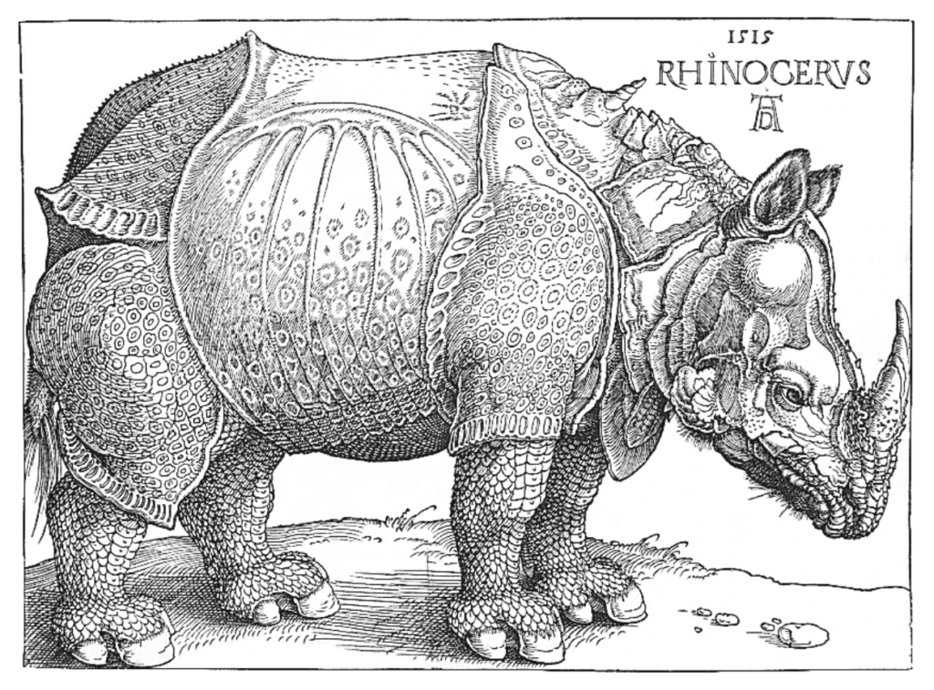 Image of a Rhinoceros, F.J. Cole, “The History of Albrecht Dürer’s Rhinoceros in Zooological Literature,” Science, Medicine, and History: Essays on the Evolution of Scientific Thought and Medical Practice (London, 1953), ed. E. Ashworth Underwood, 337 – 356. From page 71 of Edward Tufte’s Visual Explanations.] But tight integration of graphics with text is central to Tufte’s work even when those graphics are ancillary to the main body of a text. In many of those cases, a margin figure may be most appropriate. To place figures in the margin, just wrap an image (or whatever) in a margin note inside a
 p tag, as seen to the right of this paragraph.
If you need a full-width figure, give it the fullwidth class. Make sure that’s inside an article, and it will take up (almost) the full width of the screen. This approach is demonstrated below using Edward Tufte’s English translation of the Napoleon’s March data visualization. From Beautiful Evidence, pages 122 – 124.
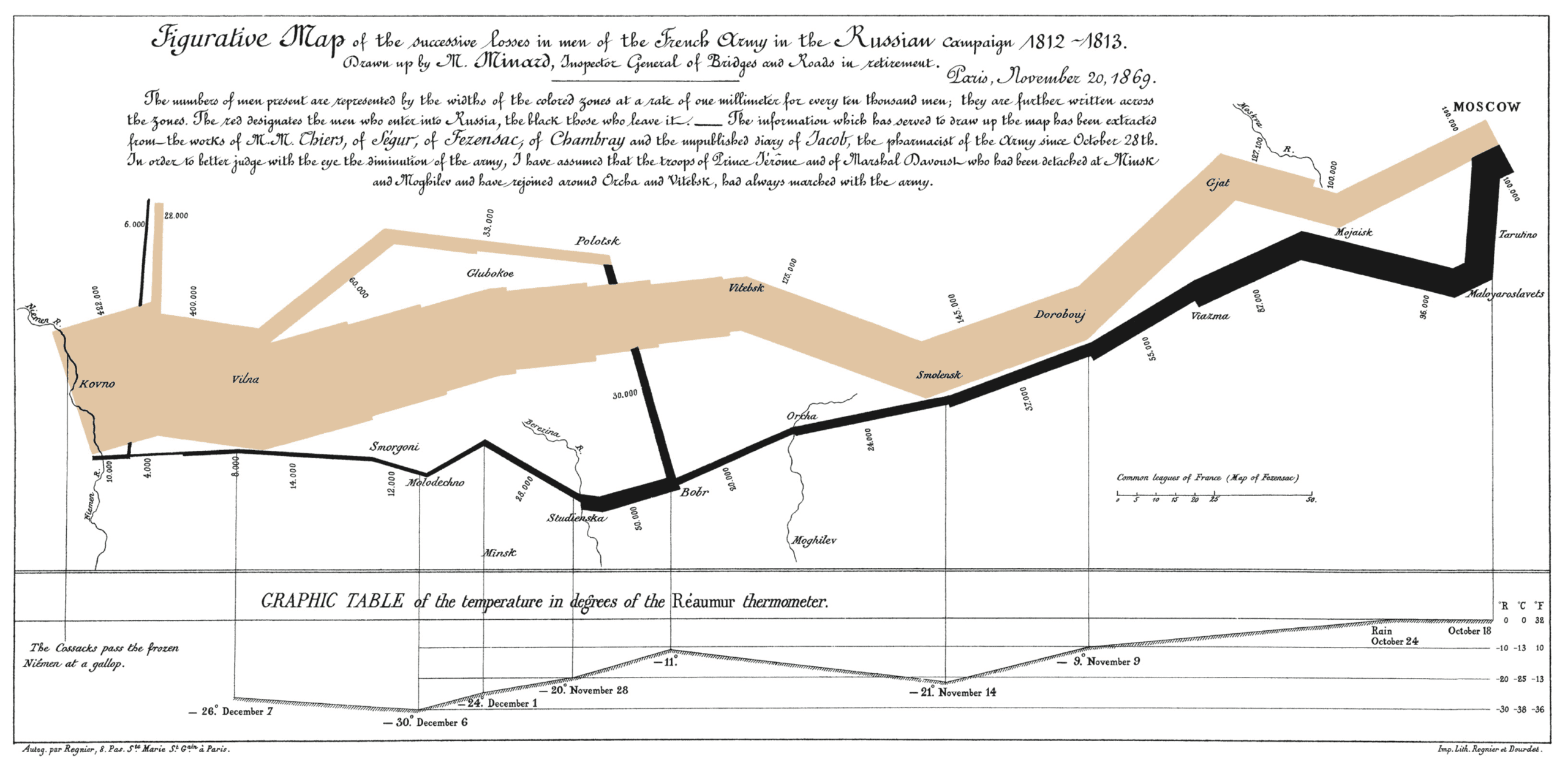
figure.fullwidth figcaptionCode
Technical jargon, programming language terms, and code samples are denoted with the code class, as we’ve been using in this document to denote HTML. Code needs to be monospace for formatting purposes and to aid in code analysis, but it must maintain its readability. To those ends, this implementation of Tufte CSS shifts gracefully along the monospace spectrum from the open-source Cousine to the elegant but rare Consolas all the way to good old reliable Courier.
Extended code examples should use a pre tag with class code. This adds control over indentation and overflow as well:
;; Some code examples in Clojure. This is a comment.

;; applying a function to every item in the collection
(map tufte-css blog-posts)
;;;; if unfamiliar, see http://www.lispcast.com/annotated-map

;; side-effecty loop (unformatted, causing text overflow) - from https://clojuredocs.org/clojure.core/doseq
(doseq [[[a b] [c d]] (map list (sorted-map :1 1 :2 2) (sorted-map :3 3 :4 4))] (prn (* b d)))

;; that same side-effecty loop, formatted
(doseq [[[a b] [c d]] (map list
                           (sorted-map :1 1 :2 2)
                           (sorted-map :3 3 :4 4))]
  (prn (* b d)))

;; If this proselytizing has worked, check out:
;; http://howistart.org/posts/clojure/1
ImageQuilts
This demo omits ImageQuilts, since this site does not use them. See the ET forum announcement thread for more on quilts.
Definition Lists
Here is an example of how you might style a definition list. Styles are applied to <dl> elements with the class glossary.
Thieves’ Cant
Some slang devoted to various birds and fowl. [Sidenote: Thieves Cant, The Website of Pascal Bonenfant]
- Biddy, Chick-a-biddy
- A chicken
- A young wench (figurative)
- Bubbly jock
- A turkey cock
- Cackler
- A hen
- Cackling cheats
- Fowl
- Chickens
- Cocks
- Hens
- Capon
- A castrated cock
- A eunuch (figurative)
- Carriers
- Pigeons
A less stylish, but perhaps more practical definition list looks like this (it is the default for this site):
More Cant
Some slang devoted to various items of clothing. [Sidenote: ibid.]
- Farting Crackers
- Farting-Crackers
- Hams
- Breeches
- Mish Topper
- A coat or petticoat
- Famble Cheats
- Gold rings
- Gloves
- Jervis’s Upper Benjamin
- a box, or coachman’s great coat
- Belcher
- A red silk handkerchief, intermixed with yellow and a little black
- Rum Clout
- A fine silk, cambric, or holland handkerchief
- Penthouse Nab
- A broad brimmed hat
Epilogue
Many thanks go to Edward Tufte for leading the way with his work. It is only through his kind and careful editing that this project accomplishes what it does. All errors of implementation are of course mine.